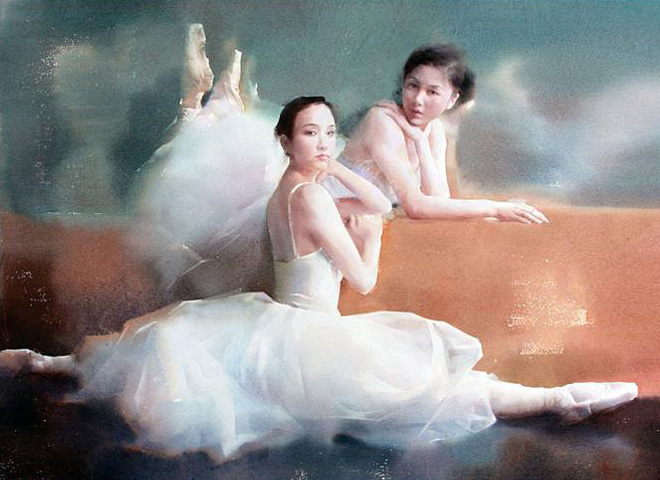
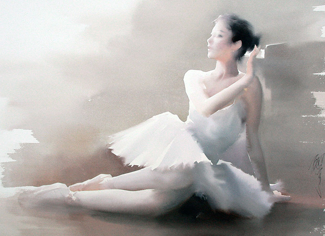
This amazing watercolorists is well known for his ballerina series.
There’s a distinct softness to his watercolor paintings and here’s what I learn from watching this DVD.
Priming the back of the paper with water to trap moist and retard the drying process
Liu Yi memtions that in China, most Artists just use these 3 brushes to kick ass
This guy is amazingly good with locking in color temperature and value shift within just one variegated wash.
Liu Yi paints mostly in high key
Achieve extreme control of wet-on-wet by prolonging the dampness of paper
Does this by priming the back of the paper with a layer of water. This seals a layer of moisture between the paper and board. With no air pocket, the evaporation process is being retarded
He also layer a wash of clear water to the top of the paper and wait until this is 90% dry before he proceed with painting Usually he waits for an hour.
He achieves maximum temperature and value shift within just one wash. Very few glazes (not even 3). Most of his work is superbly executed within one variegated wash. He has an excellent control over the concentration of pigment.
He doesn’t like pencil mark on his painting and approach painting straight from pigment.
He uses Fabriano Artistco, Arches and Saunders Waterford paper and prefers one over another depending on subject matters. All these 3 paper has different end results to the color.
He is a master who understand water’s characteristic and brings along a
thermometer so that he can figure out the time he has to paint before
the paper dries up. For him the optimal humidity if 60%. Anytime less,
you will have to paint faster.
Sometimes use hair dryer to aim at location to control the moisture
He mentioned that most Chinese watercolorist in China rock the industry with just 3 brushes.
A calligraphy brush that is versatile and can be a rigger (made from wolves fur)
2 other flat brushes. ( made from wolves fur)
Though he is sponsored by Escoda, he has trying to get them to make these wolves brushes he uses..
I am totally inspired.
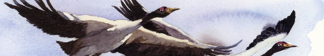
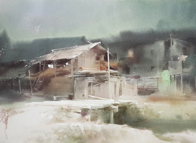
some of his amazing work.
He did mention that its important to be inspired by your subject matters.
I think the most important thing in painting isn't color. Rather it is Values. A painting, without good value structure will struggle to establish "recognizable" forms. Essentially, this is how our eyes works and may also explain why those who suffer from color blind can still see a picture.
Color Inherit Values.
Every color inherit a different value. At its fullest intensity, a bright red is actually darker than a bright yellow. If you try to run a red print through the xerox machine, it will come out dark. If you run a yellow print through the xerox machine, it will come pale. This is their values.
How does this affect painting ?
Beginner often have the problem of painting without understanding this. To make things worst, they often like to start by working in a transparent medium like watercolor. Transparency, although alluring creates this addition dimension and complexity that prohibits most from progressing + understanding. This is why most Art colleges start student off with Gouache. Gouache, is essentially an opaque form of watercolor and it helps with training .....
Way to alter the value and chroma of a color. Values as indicated on the right.
Understanding Chroma and value
Chroma = A hue at its purest intensity . In short, a red that is not contaminated by any other pigment is most chromatic.
A color can change in values by a few ways.
You can add black or white to it and this can alter its value.
You can add grey to it and it will retain the value of the color, but kill its chroma. Basically it will looks more and more towards the grey...
You can also add a different color to it and that will alter its chroma, or color completely.
A popular method of changing a color's chroma and value is to neutralize a hue with its complimentary color. (color opposite the color wheel)
What if I can't see the value of a Color?
Training your eyes to see value takes time and this is why Chiaroscuro is vital to this process of training the eyes. If you can at least recognize the extreme values of the colors, you can still produce a decent image.
One way to aid learning this is to test your paint over a transparent layer of acetate on top of a grey-scale chart. I integrated the value chart feature into a sketchbook that I came up with. Unfortunately many who can't paint don't seem to understand. So, I am here to explain it again.
checking value before application. I put a test paint over transparent acetate on top of a value chart to check.
When color is against the correct value, you see that it blends in closer. It won't be so clean sometimes. This is why it takes time to train your eyes.
adding white allow me to shift a gouache's value to the right.
Putting these together:1) Recognize and accept that value is more important than color.
An example of a value study assignment I did when I was in Art School. Done in Gouache at Columbus College of Art.
2) Train your eyes to be able to see value of colors. Limit your palette to just one or two colors. A good start would be to start off with just 2 complimentary colors from the color wheel.
3) When you put two colors together, complete with the freedom to use black or white to shift its value ? You will realize that there's plenty for you to work with. Work on this before expanding your palette into other colors.
Over here, Two complementary colors sealed the deal. This process allow you to slowly move into the territory of color temperature. Notice over here, I still didn't grasp color temperature and was faking it through with just values and chiaroscuro. It takes time to get it.
Another study with Chiaroscuro and complimentary colors. Notice that I chart out the subtle colors to train my eyes over chromatic and value shifts.