Monday, November 9, 2015

Notes from Chien Chung Wei's DVD

Notes from Chien Chung Wei's DVD
Chien Chung-Wei is a rising star in the watercolor world.  
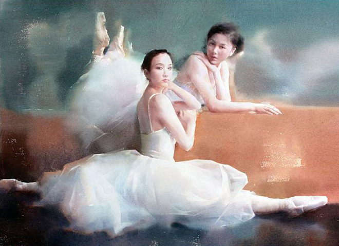
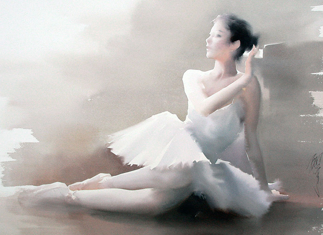
His wife, Jasmine Huang is also a superb watercolorist.
I recently got a hold of Chung-wei’s DVD and here are some my notes & observations from his Masterclass through the DVD. I highly recommend this DVD. There are much more in the DVD that I won’t share here   Go buy the DVD and support the Artist please.

DVD's URL is here:
http://www.boutiquedesartistes.fr/dvd-master-class-aquarelle-sur-le-motif-avec-chien-chung-wei.html?___store=en&___from_store=fr


Notes from his DVD
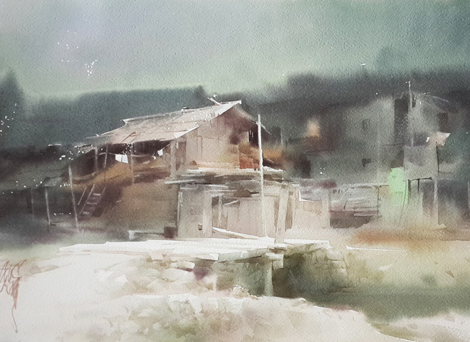
  • Only started plein-air 2 years ago. Developed his skills in-studio for the longest time.
  • Mentioned that in-door techniques can complement Plein-air.
  • Uber fast painter. He does this by pre-mixing a big mix of his paint (both warm /cool) before attempt. His painting movements makes me anxious. (laughs)
Mixing enough before he paints. He paints fast

  • His strength lies in design. Simplifying what’s in front. In short, he’s a highly effective painter.
Complete within 1-2 hours. 

  • He terms the mid-tone area as the rainbow color zone ( he deploys the greatest ranges in color temperature shift here, I guess))
  • Paints in limited palette. Does not hold green on his palette. Instead, his wells have more blues.
No greens but more blues

  • Design his composition and plan his road map extensively when he sketches with the pencil
"Taking the line out for a walk " - Chien Chung Wei
  • Block out the darks with his graphite first. He uses line weight to plan as well
  • He emphasized that "the line is out for a walk" whenever he draws. This is his personal expression of finding rhythm, shapes and composition.
  • He blocks out the mid-tone and the dark while reserving the light shapes. Typically, he completes the mid-tones and dark by means of pigment concentration. Very little usage of glazes. Rather, he allocates layering to the details. Quite similar to Alla-prima in oils. He reminded me of Ong Kim Seng's approach. Dark first. 
  • Switches brushes a lot. Typically paints with a bunch of them in his hands. He memtioned that smaller brushes are crucial for the darks (my guess- concentration of pigment)
  • Very daring and confident with his scratches. Even brings out a palette knive and carve straight at the paper.

Visit his website for more of his beautiful work :) If you know mandarin, you can follow him on his facebook account. He regularly share interesting stories and philosophies behind his work.


Friday, August 28, 2015

selected gestures of Aug 2015


Crimson lips scintillated in the cool cabin

Pretty mum and not so pretty child. What happened ?

Distance apart

negative spaces

foreshorten cross legs.

Turning

Sleep time

Beautiful Japanese Wife and family

Pretty teenager

Girls

Tuesday, July 21, 2015

Notes for Enhancing your Sketches with Watercolor . (Beginner's ink + washes)

Here's a simple tutorial for someone venturing into watercolor for the first time.
  • Its important to first establish your fundamental skills in shape recognition, value allocation and color temperature. 
  • Eliminate the complexity of colors by first focusing on values 
  • Progress into two colors when you are comfortable with just one color. Acquire temperature sensitivity by focusing on the extreme warm and cool. This is more "valuable" than splashing random colors on your work.
Lets assume that I want to work on a sketch of the skyline of Singapore.


Photo Reference from the internet. Its important to recognize the values of the scene. This allow you to design the shapes to your painting. You may draw with Micron Pens or load a fountain pen with waterpoof ink (noodlers's ink). Washes won't smudge lines made with waterproof ink.. They have to be waterproof though. 


  • Permanent lines make it easier for your painting to sustain the shapes, Even when the colors failed to sustain the shapes of your painting ? The lines are there to support it. This is why ink & wash is a very reliable technique to establish a painting fast. In short, its quick and easy.

4 simple steps to glaze your scene with one color. 
  • To establish atmospheric perspective. You just need to glaze the scene with 4 flat/ graded washes. 
  • Its important to allow each glaze (layer) to dry before proceeding onto the next. 
  • Watercolor is transparent. When you apply a wet layer to an already dried layer ? you bump up its value and make things darker. Contrary to oil painters, water-colorist usually work from light to dark, building up values towards the end.
  • You can only lift the value off if the pigments are non-staining. Some pigment stains and a "lift" is out of the question.
To finish off, you can drop a soft-edged reflection of the scene. 


  •  
  • A soft edged reflection can easily be accomplish if you first prime the dried paper with clear water....To do that, Paint the shape of the reflection with clear water first. After that, simply charge in a thin wash of color.

Quick example with the top sketch done quickly with just one color.
  • Beginners, allured by the appeal of colors often make the mistakes of painting without temperature sensitivity. In actuality, a limited palette is more than sufficient 
  • The top painting was completed with just one color to establish a simple image. It could be better for sure. 
  • The bottom painting was completed with merely two colors. One Warm and one Cool. Realize that by just using two colors, I was able to successfully illustrate both dark versus light and depict a good sense of spatial depth. Two colors were more than enough to secure that. 


Saturday, July 4, 2015

My Perfect Sketches


I wanted to embark on a pan-America painting trip. You know - build my own camper van, live on electricity generated from solar panels, and most importantly - staying a little off the grid to paint my heart out. Though I previously lived in America for close to a decade, this dream was never fulfilled and it is becoming more distant as time goes by.

Recently, I decided to take action and contacted corporations, art foundations and various other organizations for sponsorship. Unfortunately, none of the companies that I contacted could envision the potential of my trip, and all declined to offer assistance.

At the brink of giving up, my collaborator from a previous project, Bynd Artisan, sent me a prototype of the finest watercolor sketchbook that I have designed. I thought about doing what I can with what I have, and decided to paint the places that I could have visited and painted if I could have gone on this dream road trip.


Every Artist has within them a desire to fill their sketchbook with only perfect sketches.
These are my Perfect Sketches.

It took me more than a month to complete this entire sketchbook.


Thursday, June 25, 2015

Notes on Liu Yi's Watercolor application

Notes on Liu Yi Painting

http://www.liuyi.com.cn


This amazing watercolorists is well known for his ballerina series.

There’s a distinct softness to his watercolor paintings and here’s what I learn from watching this DVD.


Priming the back of the paper with water to trap moist and retard the drying process

Liu Yi memtions that in China, most Artists just use these 3 brushes to kick ass

This guy is amazingly good with locking in color temperature and value shift within just one variegated wash.
  •  Liu Yi paints mostly in high key
  •  Achieve extreme control of wet-on-wet by prolonging the dampness of paper 
  • Does this by priming the back of the paper with a layer of water. This seals a layer of moisture between the paper and board. With no air pocket, the evaporation process is being retarded
  • He also layer a wash of clear water to the top of the paper and wait until this is 90% dry before he proceed with painting  Usually he waits for an hour.
  • He achieves maximum temperature and value shift within just one wash. Very few glazes (not even 3). Most of his work is superbly executed within one variegated wash. He has an excellent control over the concentration of pigment. 
  • He doesn’t like pencil mark on his painting and approach painting straight from pigment. 
  • He uses Fabriano Artistco, Arches and Saunders Waterford paper and prefers one over another depending on subject matters. All these 3 paper has different end results to the color. 
  • He is a master who understand water’s characteristic and brings along a thermometer so that he can figure out the time he has to paint before the paper dries up. For him the optimal humidity if 60%. Anytime less, you will have to paint faster. 
  •  Sometimes use hair dryer to aim at location to control the moisture
  • He mentioned that most Chinese watercolorist in China rock the industry with just 3 brushes. 
    • A calligraphy brush that is versatile and can be a rigger (made from wolves fur)
    • 2 other flat brushes. ( made from wolves fur) 
    • Though he is sponsored by Escoda, he has trying to get them to make these wolves brushes he uses..
  • I am totally inspired.

some of his amazing work.

He did mention that its important to be inspired by your subject matters. 

His famous series of ballerina

His website
http://www.liuyi.com.cn

Sunday, June 7, 2015

Color's Chroma and its values

Lesson 1 of color theory.

I think the most important thing in painting isn't color. Rather it is Values. A painting, without good value structure will struggle to establish "recognizable" forms. Essentially, this is how our eyes works and may also explain why those who suffer from color blind can still see a picture.

Color Inherit Values.
Every color inherit a different value. At its fullest intensity, a bright red is actually darker than a bright yellow. If you try to run a red print through the xerox machine, it will come out dark. If you run a yellow print through the xerox machine, it will come pale. This is their values.

How does this affect painting ?
Beginner often have the problem of painting without understanding this. To make things worst, they often like to start by working in a transparent medium like watercolor. Transparency, although alluring creates this addition dimension and complexity that prohibits most from progressing + understanding. This is why most Art colleges start student off with Gouache. Gouache, is essentially an opaque form of watercolor and it helps with training .....

Way to alter the value and chroma of a color. Values as indicated on the right.


Understanding Chroma and value 

  • Chroma = A hue at its purest intensity .
    In short, a red that is not contaminated by any other pigment is most chromatic. 
  • A color can change in values by a few ways. 
    • You can add black or white to it and this can alter its value.
    • You can add grey to it and it will retain the value of the color, but kill its chroma.  Basically it will looks more and more towards the grey...
    • You can also add a different color to it and that will alter its chroma, or color completely. 
    • A popular method of changing a color's chroma and value is to neutralize a hue with its complimentary color. (color opposite the color wheel)

What if I can't see the value of a Color?
  • Training your eyes to see value takes time and this is why Chiaroscuro is vital to this process of training the eyes. If you can at least recognize the extreme values of the colors, you can still produce a decent image. 
  • One way to aid learning this is to test your paint over a transparent layer of acetate on top of a grey-scale chart. I integrated the value chart feature into a sketchbook that I came up with. Unfortunately many who can't paint don't seem to understand. So, I am here to explain it again.
checking value before application. I put a test paint over transparent acetate on top of a value chart to check. 


When color is against the correct value, you see that it blends in closer. It won't be so clean sometimes. This is why it takes time to train your eyes. 
adding white allow me to shift a gouache's value to the right.

Putting these together:1) Recognize and accept that value is more important than color. 

An example of a value study assignment I did when I was in Art School. Done in Gouache at Columbus College of Art. 


2) Train your eyes to be able to see value of colors. Limit your palette to just one or two colors. A good start would be to start off with just 2 complimentary colors from the color wheel.

3)
When you put two colors together, complete with the freedom to use black or white to shift its value ? You will realize that there's plenty for you to work with. Work on this before expanding your palette into other colors. 

Over here, Two complementary colors sealed the deal. This process allow you to slowly move into the territory of color temperature. Notice over here, I still didn't grasp color temperature and was faking it through with just values and chiaroscuro. It takes time to get it.


Another study with Chiaroscuro and complimentary colors. Notice that I chart out the subtle colors to train my eyes over chromatic and value shifts. 

Here are some youtube videos that is helpful

Gouache with warm and cool with zorn palette. 


Understanding value and color with watercolor .


Iterating the importance of VALUE.


I hope this post help . Let me know :)


Sunday, May 31, 2015

Chiaroscuro & Notan (Concept of extreme light and dark)

I wanted to get into color theory. However, before jumping right into that, I thought it was important to iterate on the concept of Chiaroscuro. (Extreme light versus dark)


With the ubiquity of Photoshop, many have abandoned their seeing skills. (think "control+L"/ crunch Levels)  If you have seen stenciled Street-Art? You most likely would have seen a digital version of chiaroscuro... (Through Photoshop)

Remember that Hope poster designed by Shepard Fairey for the Obama presidential ?
Well, that's a digital chiaroscuro.
Ever wonder how he arrived at the shapes for the final poster ? Chiaaaaroscuro.
When traditional painters advocate the technique of squinting eyes ? Its pretty much the same deal.

Shepard Fairey's poster was acquired by the Smithsonian Institution in 2009 for its National Portrait Gallery. Interestingly, he was sued by Associated Press for a using someone's photograph without permission. (He lost the case in the end)

Digital Leveling is similar to squinting your eyes to see the extreme light versus dark.

In fact, chiaroscuro always seem to impress...I am sure you have heard of girl/boy who can draw or paint with coffee stains, hair or dirt ?? Well the list goes on....
Example of Chiaroscuro in modern context.


Another example of Chiaroscuro


Why is this important in painting ?
Think about it. If you can construct an image in just two tones ? You would have effectively secure a recognizable picture with a wide margin for other creative expressions (colors, texture and etc).
This is why its important to squint your eyes until you are well conditioned in "seeing"extreme/light shapes. Of course, with digital imaging and applications, many have chosen to let the software "see" for them. When you understand this and some color theory, you realize that it isn't too difficult to match a painting to a photograph,

Now Lets look at how I draw with Chiaroscuro
With just one light source, there is clarity to the shapes that I will draw.
Squinting your eyes collapse the values and allow you to decide on the region that you would designate light/dark shapes. Remember, the objective is to be able to recognize just two tones.


I set up a bust lit with one light source for Chiaroscuro
When its black and white and if you squint hard ... the shapes should be similar to these. This allow you to first lock in light versus dark shapes.

After I establish the light and dark shapes, I stop squinting and begin to observe the relationship of dark among the shapes.

Lets not forget the old master, Caravaggio who is known for his Chiaroscuro

Caravaggio was all about the Chiaroscuro :) Back then, they would do a value study underneath and glaze it to perfection after.

My white board marker doodle of Raft of the Medusa, by Gericault.... I didn't manage to finish before I ran out of marker ink.(two tones is more than enough to make an image)
The real deal of Gericault is explained through this youtube video...
Raft of the Medusa, remains to be one of my favorite painting.
Glad to have seen it 2 years ago at The Louvre.