Sunday, May 31, 2015

Chiaroscuro & Notan (Concept of extreme light and dark)

I wanted to get into color theory. However, before jumping right into that, I thought it was important to iterate on the concept of Chiaroscuro. (Extreme light versus dark)


With the ubiquity of Photoshop, many have abandoned their seeing skills. (think "control+L"/ crunch Levels)  If you have seen stenciled Street-Art? You most likely would have seen a digital version of chiaroscuro... (Through Photoshop)

Remember that Hope poster designed by Shepard Fairey for the Obama presidential ?
Well, that's a digital chiaroscuro.
Ever wonder how he arrived at the shapes for the final poster ? Chiaaaaroscuro.
When traditional painters advocate the technique of squinting eyes ? Its pretty much the same deal.

Shepard Fairey's poster was acquired by the Smithsonian Institution in 2009 for its National Portrait Gallery. Interestingly, he was sued by Associated Press for a using someone's photograph without permission. (He lost the case in the end)

Digital Leveling is similar to squinting your eyes to see the extreme light versus dark.

In fact, chiaroscuro always seem to impress...I am sure you have heard of girl/boy who can draw or paint with coffee stains, hair or dirt ?? Well the list goes on....
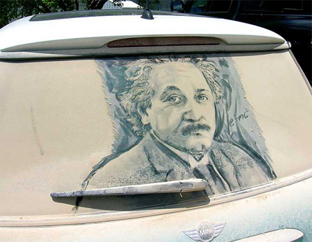
Example of Chiaroscuro in modern context.


Another example of Chiaroscuro


Why is this important in painting ?
Think about it. If you can construct an image in just two tones ? You would have effectively secure a recognizable picture with a wide margin for other creative expressions (colors, texture and etc).
This is why its important to squint your eyes until you are well conditioned in "seeing"extreme/light shapes. Of course, with digital imaging and applications, many have chosen to let the software "see" for them. When you understand this and some color theory, you realize that it isn't too difficult to match a painting to a photograph,

Now Lets look at how I draw with Chiaroscuro
With just one light source, there is clarity to the shapes that I will draw.
Squinting your eyes collapse the values and allow you to decide on the region that you would designate light/dark shapes. Remember, the objective is to be able to recognize just two tones.


I set up a bust lit with one light source for Chiaroscuro
When its black and white and if you squint hard ... the shapes should be similar to these. This allow you to first lock in light versus dark shapes.

After I establish the light and dark shapes, I stop squinting and begin to observe the relationship of dark among the shapes.

Lets not forget the old master, Caravaggio who is known for his Chiaroscuro

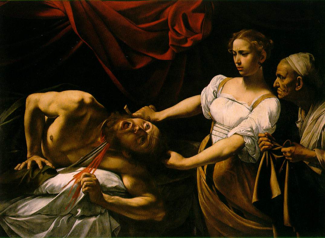
Caravaggio was all about the Chiaroscuro :) Back then, they would do a value study underneath and glaze it to perfection after.

My white board marker doodle of Raft of the Medusa, by Gericault.... I didn't manage to finish before I ran out of marker ink.(two tones is more than enough to make an image)
The real deal of Gericault is explained through this youtube video...
Raft of the Medusa, remains to be one of my favorite painting.
Glad to have seen it 2 years ago at The Louvre.


Tuesday, May 19, 2015

How I sharpen my pencils.

I never like to use a pencil sharpener.

Why ? Well, I can get a sharper pencil and waste less graphite when I do this.
More importantly,  by shaving my pencil, I can carve a wider graphite surface. This allow me to draw without exhausting my point, maintaining and reserving the the sharpness only for the sharpest edge

Typically, I sharpen with a pen knife until it is quite sharp

I make use of a sanding block to get it closer to the point i need. You may store the graphite powder in a container when you do this. Saving precious graphite along the way.
There isn't a better tutorial than this one I found on youtube by Karl's Gnass. He is a top notch Artist with a series of excellent tutorial on drawings :) . Happy Drawing :)


Monday, May 11, 2015

Tea , Milk & Honey for beginners

Perhaps the most useful technique used by watercolor plein-air artists.

This technique allow you to complete a painting on-site without getting bugged down by details or with too many glazes.  Theoretically, you complete in 3 layers. However, apart from time constraint, there aren't any rules to why you should limit yourself to just 3 layers.

Here's how you work the magic. By the way, I am demonstrating with just two colors. Why ? Because beginners too often have problem managing colors . If you can't even work with 2 ? Reduce it to one. There's no prize for the artists who uses most colors.  

At the most fundamental level, one just need to ensure that that the correct sense of color temperature is in place. Excessive colors rarely enhance an image when the temperature shift is nothing but a chaos. 

Important things to remember when painting: 
  • Shapes + Composition, (If it doesn't look like a square ? It may be a rectangle )
  • Value structure / Good drawing / Chiaroscuro (extremely important for watercolor since it rely extensively on light versus dark dramatic structure )
  •  Soft versus hard edges
  • Color temperature (warm versus cool) . There is no need to score accurate color. A painter merely depict a color's relationship to its surrounding. e.g does the color has more warm (Red or orange) or cool (Green or blue) in it ? 

Maximum coverage is made with the thinnest layer, mid tone and shadow mass are all connected with milk layer and details are left in for for thickest coat of paint. (error - Tea layer was yellow orche :)


Demonstration of the Tea layer


Demonstration of the Milk  layer


Demonstration of the Honey  layer

Putting it all together: (two colors)


The technique sounds all easy but can be quite a challenge when you are on-site and overwhelmed by the gamut of colors and details that mother nature throws at you.
The truth is, no one can paint everything on the spot. A good painting isn't a good photo and how you capture the essence creates the impression that mattered the most. (Paint language)
A few things to note:
  • Things will change.
  • You are painting an illusion and it doesn't have to include everything. 
  • A quick thumbnail study is exceptionally useful for a complicated scene. I often make the mistake of painting without preparation, only to regret after I lay down the first wash. 
  • Resolve your value structure before you paint. Changes in light cannot affect your vision if you have this road map. Its also a whole lot easier to focus on other aspects of painting if you have this. 

Putting it together for a scene


For more of this technique. I recommend the tutorial put up by Marc Taro Holmes . His has a nice cheat sheet he put up for free at his website.
https://citizensketcher.wordpress.com/paintings/


Friday, May 8, 2015

Commute Sketches April 2015

Selected sketches made in April 2015.

such if happiness
Men and their gestures
girls and their mobiles
rest and relax